FULTON HOGAN – New Website build
The former website was outdated, uninspiring and did not reflect the corporate standing of the company. Elements were too simplistic and worked against Fulton Hogan’s growing success.
This contributed to a poor user experience and the layout and navigation aspects undermined any engaging content.
Fulton Hogan looked like a local business that had gone well beyond its humble beginnings rather than an innovative world-class company undertaking huge infrastructure projects.
Raising the Profile
The new website needed to become a stronger and more effective platform for promoting the scope and scale of works that were underway. It also needed to showcase the company’s accomplishments and highlight their ability to deliver to the highest standards.
Fulton Hogan is now a multi-billion dollar enterprise that is able to work on everything from hydro schemes, port redevelopments, airport taxiways, complex freeway bypasses and even windfarms.
It would be easy to simply promote itself as a growing corporate entity but that is not what Fulton Hogan is about. The website has the task of giving a personality to a company that prides itself on being more of a family than just a business.
The How
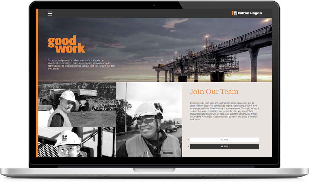
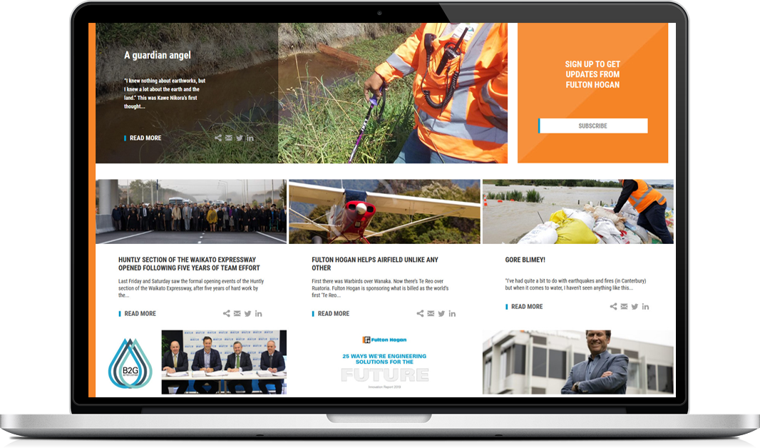
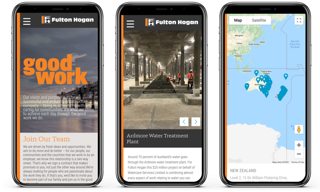
Digital Animals built the new website with a fresh and inviting look. A cleaner design, more accessible layout and site navigation ensured a greater ability to Show rather than simply Tell the ongoing success story of Fulton Hogan.
The visual elements work in unison to provide a window into a multi-national infrastructure giant. One with a heart, with strong community ties and a goal to make a positive impact in everything it does.

The Future Outlook
The Fulton Hogan website now embodies the character of the company in the strongest and most engaging way. It is a powerful way to capture and promote each and every future success.
Ready to be the next success story?
Talk to us today.


