If you have been keeping an eye on your website with Google Analytics, you may have noticed a little section called bounce rate. If you want to know how to make people stay on your website, take a look at these key bounce rate reduction tips.
If you’ve been keeping an eye on your website with Google Analytics, you may have noticed a little section called bounce rate. This rate indicates the percentage of sessions in which guests leave your website before travelling to another page. To increase the interactivity of your website, you need to encourage users to stay. If you want to know how to make people stay on your website, take a look at these key bounce rate reduction tips.
1. Invest in a custom web design
Websites that look good are more appealing to visitors. Encourage your guests to stay longer with a visually appealing website. Aesthetic and navigation are important factors. There is no point in having a pretty website if your guests can’t find their way around it.

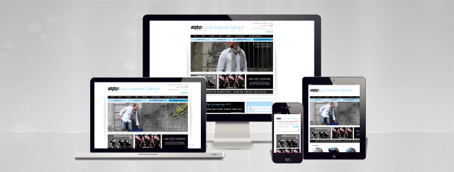
Make sure that any additions you make to improve the look of your page do not increase the loading time. Media and plugins should be managed and monitored to ensure they do not slow down your site. You can make your website more user-friendly by guiding customers through the pages with clear direction. You can do this with menus and sidebars, as well as internal linking or a call to action at the bottom of your page.
2. Create great content
If you’re struggling to figure out how to make people stay on your website, we have some helpful content tips for you. When a website has good content, users are more likely to continue their browsing on your site. Giving visitors what they are looking for is the best way to avoid frustration and increase the user experience.
Tips for engaging online content
• Think about your target audience
Write content that speaks directly to your ideal visitor. If people feel like your page is relevant to their needs, they will be more likely to continue their session.
• Use subheadings, bullet points, and small paragraphs
Breaking your content into smaller sections will help people focus. Users can find the information they want quickly with clear subheadings. If guests are confused about your content they will abandon your page.
• Include internal linking
Link to any relevant content that your visitors may be interested in and encourage them to explore the rest of your website.
• Make sure the spelling and grammar is correct
Spelling and grammar is very importrant important. If your content has a lot of mistakes, guests will swiftly lose trust in your website. You can install helpful apps like Grammarly in your browser to help you identify any mistakes.

3. Make your website faster
If a website takes a long time to load, visitors are more likely to get fed up and leave the website. You can encourage people to spend more time on your pages with website speed optimisation. When you reduce your page load time, customers are more likely to trust your website and continue browsing.
Speed is even more important when people are accessing a site from their mobile or smartphone. The expectation of a fast website is increased when people are browsing on their phones. 85% of people anticipate faster loading times on their phone when compared to their expectations during desktop browsing. With more and more people using their smartphones as their primary browsing device, speed optimisation should not be overlooked.
• 44% of customers reported feeling anxious during slow transactions
• 64% of smartphone users expect pages to load in less than 4 seconds
• Only 2% of the top 100 e-commerce sites are optimised to load faster than 4 seconds on smartphones
You can view these statistics and more on the Radware blog.
Take the website speed test
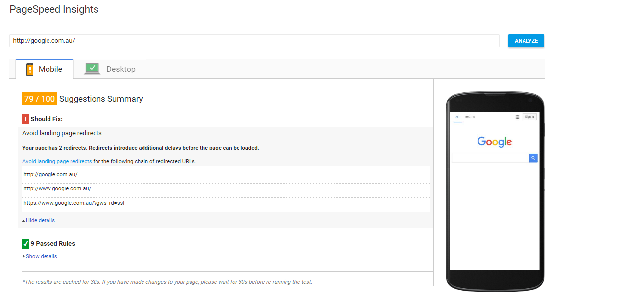
If you’re worried about the speed of your pages, you can test your website’s performance with the free Google PageSpeed Tool. Just copy and paste the URL of the page you would like to gather information about.

After you have run your URL through the tool, it will show you a list of suggestions where you can increase speed. If your mobile or desktop site displays in red, it means there is a lot of potential for speed optimisation. The tool can give you specific areas to improve and show you how to make people stay on your website. If you are having trouble understanding some of the ‘should fix’ tips, we encourage you to get in touch with us so we can assess your website for you.

If you have any questions about the content in this post, get in touch with us today. We are specialists in digital marketing and website design. Ask us to create a custom plan to suit your needs.
Author: Anna Clark – Copywriter & Digital Marketing Assistant, Digital Animals


